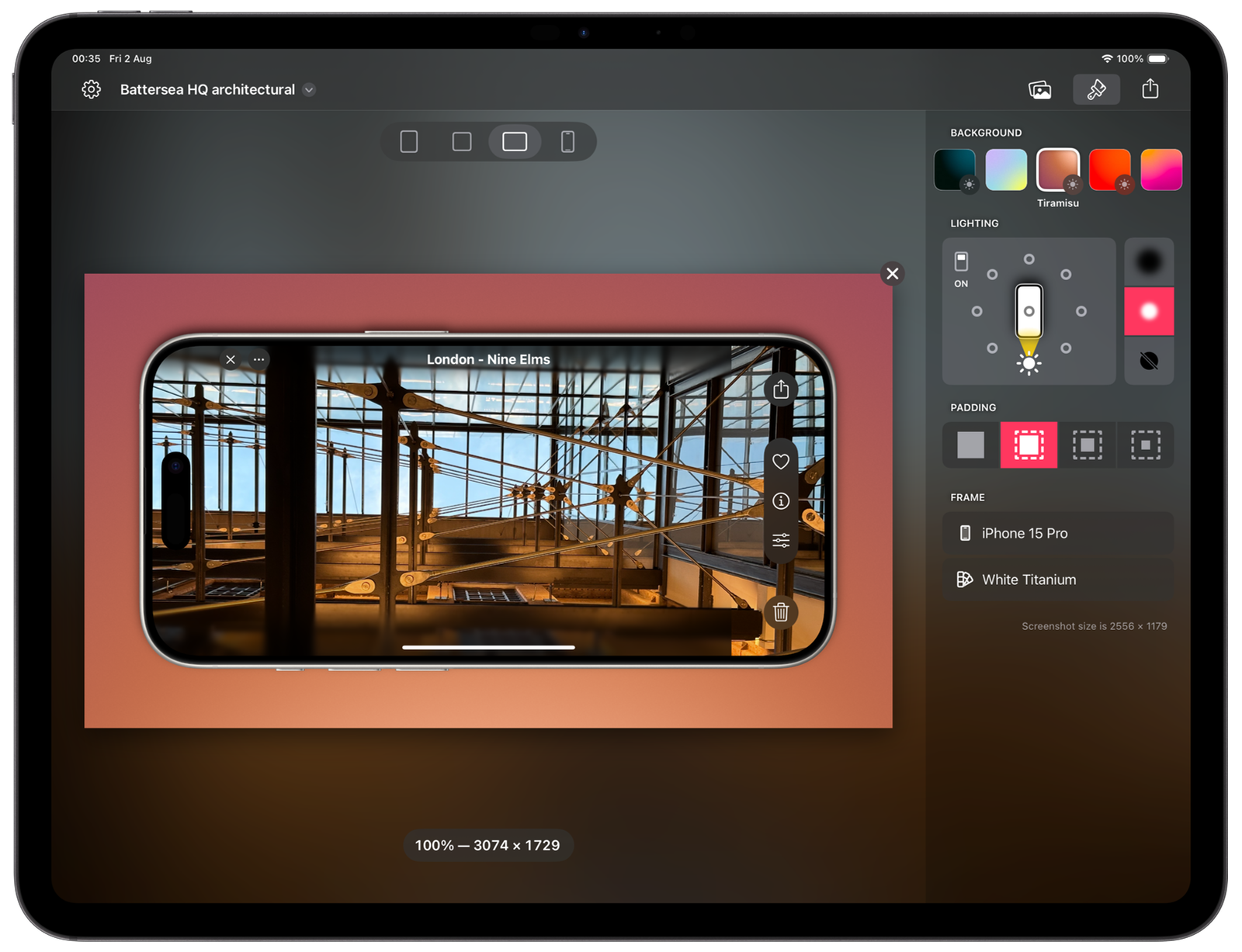
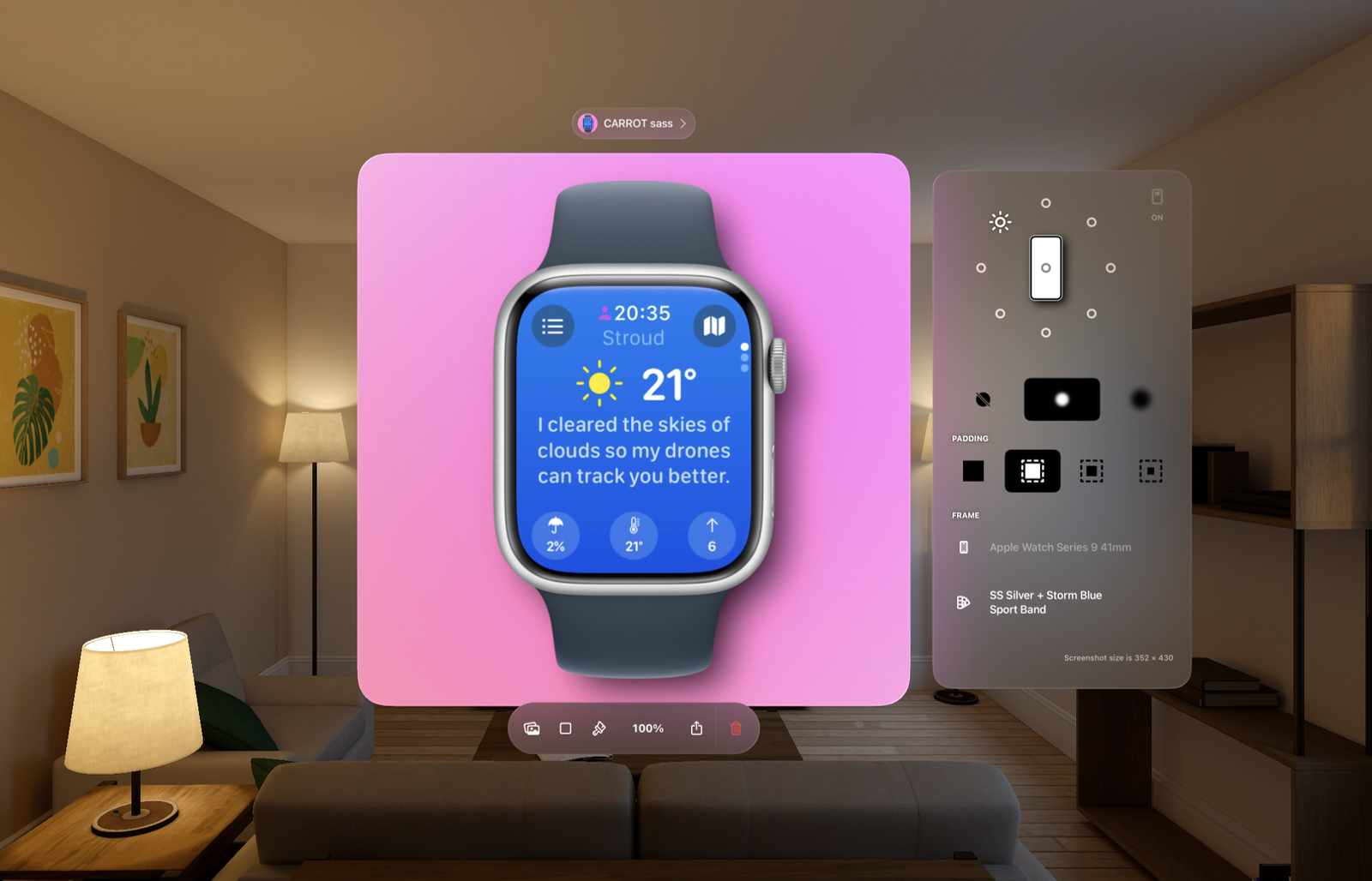
🚀 Launch day! Shareshot 1.0 is live in the App Store 🎉
Today we launched Shareshot! We’ve been working on this app for almost exactly a year, and we’re so pleased to be able to finally ship it. Here’s a little backstory and behind-the-scenes for those of you into app development.
If you haven’t tried Shareshot yet download it here.

The seed of the idea
In August 2023, somebody I follow on Mastodon posted an innocuous screenshot of something, framed in an iPhone frame and on a nice looking background. I hadn’t really noticed anybody post a screenshot like that before so I asked what app he used. I checked out the app and it was really quite nice and well done.
This got me thinking because I’d just been dealing with all the App Store, press kit and social media promotion screenshot hassles of our previous app Captionista for video subtitling. Providing both unframed and framed screenshots for a press kit is something I like to do to make it as easy as possible for journalists to use the images. Promoting apps on social media requires posting visual content — and framing screenshots helps to put them into a less abstract context.
I’d also been using a mixture of Federico Viticci’s excellent free screenshot framing shortcut and the frameme tool to automate framing as part of my Fastlane build and static website press kit build process.
I felt that there were opportunities to improve on all of this:
- I wanted something that did a better job of only fitting screenshots into frames that fit perfectly and where possible exactly the right frame. The number of apps out there that would just throw a screenshot into a frame with the wrong notch, corner radius, exhibit hairline glitches at screen edges or straight-up stretch screenshots to fit some random frame was horrifying.
- Make it so users don’t have to wait for an update to the app to support new device frames.
- Reliable, fast automation of batch framing.
- A Share Extension so that you can directly frame screenshots and share them without even having to save them to Photos.
- A single tool for all my framing needs - both for preparing images for use in other content and for ready-to-share images with backgrounds for social media.
- A wide range of background style options and a really simple and fast interface to make casual sharing of screenshots fun and not something you dread having to put together.
- Desktop-class features and UI optimised for getting work done.
Making the magic happen

The basics came together pretty quickly. I cracked the “Magic Mask” technique that allows us to support any custom frame images without you having to make a mask image first. This correctly fits screenshots into the frames without hairline glitches and prevents the sharp corners of the screenshot poking out of the rounded device corners.
Then I had to proof-of-concept the App Intents and Share Extension. This was very challenging because of bugs in iOS App Intents and the memory limitations of App Intents and Share Extensions. Exporting framed images with social-friendly aspect ratios at 100% means you have to process some very large images. Just creating two of those images in memory puts you close to or over the extension memory limits on some devices.
Creating a rendering system to handle this took a long time but it was worth it. Memory is still an issue in some cases, especially in the Share Extension but we developed some workarounds to make it less annoying if the system just decides to kill us.
The delight
It was only half way through building the app, maybe more, when we had the idea for the dynamic lighting feature available with some backgrounds.
The unique UI we have for the shadow selection naturally pushed us towards this idea, and it worked so beautifully it made us very happy. I had already spent a lot of time on the shadow direction selection UI and animations, and adding lighting support made it even more fun.
A Vision to behold

During this time Vision Pro shipped in the USA. While clearly niche right now it is obviously a very interesting platform. I went to the UK lab event to get my hands on one and try out the app to see what a visionOS version could look like.
After experiencing it and how great the native visionOS apps look, it was a no-brainer to try to make a great visionOS version of Shareshot if only to learn about the platform.
Honestly, the visionOS version is my favourite, it looks amazing on device because of the rich use of colour and focusing the UI on the content, working with all the blurred materials and lighting voodoo that Vision Pro brings.
Back to the Mac… eventually
We planned to ship on iOS, iPadOS and macOS. Early on it was quite clear that Mac Catalyst and SwiftUI was very problematic on things that are basic and should be very easy. Weird toolbar and button styling bugs, drag and drop breaking… and how to deal with windowing in an app like this.
So we punted macOS because visionOS was much more interesting and much easier. We do plan to return for a second run at macOS support but we have to time-box it. You can’t spend your life fighting other people’s bugs.
One app. Five (!) UIs.
Even without macOS and with just iOS, iPadOS and visionOS we have actually built 5 different UIs that are in the app. That’s right, five. It’s a huge amount of work.
There’s iOS portrait and then variations to make it work for landscape. There’s one each for iPadOS and visionOS and then there’s number 5 — VoiceOver.
We expended quite a bit of effort to make the app usable with VoiceOver and the other accessibility methods. We were lucky to have a vision-impaired Beta tester who tried it out for us. This was actually very challenging because there are a number of limitations in the SwiftUI accessibility APIs and with custom UI elements things are surprisingly hard to get right — and some cases are impossible to get working well in both VoiceOver and Voice Control.
We have a list of improvements we still want to make to the accessibility support, and we plan to get to those soon after launch.
Ship. Ship. Ship. Ship. Ship. Ship. Ship.
Coming close to a year of development using every spare moment I had, we just had to ship as soon as it was “good enough”. Indies know this is a perpetual challenge, and there’s a lot of people who would say we released far too late — that they would have shipped earlier with a more minimal MVP.
However with an app like this there are some hard fundamentals like the renderer that just have to be done before you have anything that is remotely viable. It takes time. Shortcuts, Share Extension and custom framing were the critical distinguishing features of the app and they also took a lot of effort. This was the marketing story of the app, otherwise it’s just like all the other apps but with a slightly different UI.
So we had to aggressively cut things we considered really important, just to ship. Part of the benefit of being a subscription app is that we can deliver these features to users later as we continue to add value to the app, so this is a win/win really. Customers get the app quicker, we get income and feedback quicker, and we bring continuing value to our supporters.
What did we cut that we considered really important originally? Well of the many things I would say multi-image support in the UI is a big one, so you can style 5 screenshots at a time and share them all at once. You can do that in Shortcuts right now but it will come to the UI in the coming months. Another is support for partial screenshots, where you show say the top 50% of a phone only.
We better get to work!
Thanks to everybody who has supported us by installing, rating, reviewing or paying for the app!
